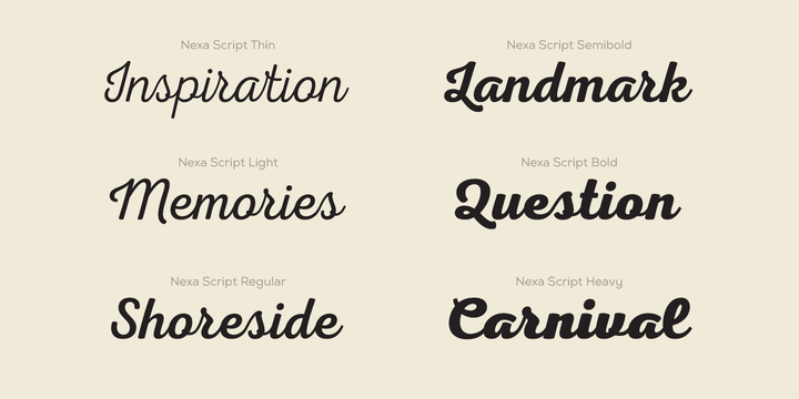
Script fonts can be best described as mimicking cursive or calligraphy. There are script fonts that connect, those that don’t, those that look handwritten, and those that look like calligraphy.
Script fonts should be used sparingly to keep your designs readability level high.
There are countless of script fonts out there, too many to narrow down which ones are the most popular. If you are looking for script fonts I would recommend checking out dafont.com.

Now that we know what script fonts are defined as, we can go a little further and research if script fonts are used in online design, where they should be used, and maybe where they shouldn’t be used. I am curious to see what others have to say about using script fonts in online design, because I was taught to use them sparingly in printed designs, and I wonder if the same rules apply to online design.
To start, I found an article from designhack.net where they list 7 tips for choosing the best fonts for a website.
The article starts by listing some basic fundamentals and definitions every web designer should be aware of. Although I knew most of these terms such as, kerning, leading, and contrast, I was surprised to read that you shouldn’t use more than three different typefaces. I knew to not use a lot of different typefaces, but three seems like such a small number.
The article advises designers to first get all of the text they need and then choose a font, instead of trying to decide on a font before even typing, which is something I am guilty of.
I had high hopes for this article because I thought it would be helpful for finding the best fonts to use online, and although it did link a few fonts they thought worked well on the web at the end of the article, the rest of the tips were a little vague and mostly things I already knew.
Although this article isn’s specifically about script fonts, I can take the tips to consider readability and not use more than three typefaces to conclude that script fonts should not be used in areas where there is a lot of text.
