Blog Spotlight: Brooke Miccio

This may be one of my favorite blog spotlights because of the homepage on Brooke’s blog. Her home page features a video montage as her header image, and I’ve never seen anything like it. I thought this was a really creative way to show off one of her skills, which is video production and editing. It also captures readers attention and makes them want to look more into her site.

It was hard to capture in a screenshot, but the header featured little snippets of video from her youtube channel and I thought it was a really unique way to design a header. Each video clip being played is slightly faded and when you hover over the header image, the video becomes clearer. There is also a welcome header that features a button to her digital portfolio section. Although I am unfamiliar with the video feature, the faded images, centered text, and rounded button would be easy enough to recreate.

Her about me page would also be easy enough to code in html, as it seems to be a text box with an image on the left and text on the right. Although this is a simple design, the font she uses in her header, the simple and elegant colors, and her images make it look more professional and high end.

I also really like how she had a page that was a digital resume. Again, this could be recreated through making to sections side by side, where one is text and the other is an image. I also understand that she may have wanted to incorporate different colors on this page than in her home or about me pages, but I think the light blue defeats the professional look she established with her other pages. I would choose another blue, or stick to the light gray color used before.

Overall, I would say Brooke does a good job with her website. I thought the images were well planned and placed, and I liked most of colors used on the pages. I also liked how she took simple html section designs and turned them into something that looked like it took more time to create, such as the video header. However, I was expecting more blog posts when in reality her website is just a digital resume. This is fine, but could be confusing to some of her followers who were expecting to find more content from this website.

To fix this confusion I would suggest that Brooke either choose to write more content under her blog section, or, get rid of this blog section all together. If she were to get rid of the blog I would then say for her to make it clearer that this website is meant for future employers, and not her followers. She should make it more clear on her home page by making the text that says “digital profile” bigger. She may even want to add the digital profile section to be a scrolling feature on her homepage, or make the tab in the navigation section closer to the home page.

Blog Spotlight: Barefoot Blonde

This blog was created by Amber Fillerup Clark, and the content is geared towards women who are mostly young mothers. The author creates a wide range of content such as lifestyle, beauty, tips to new moms, fashion, travel, and more. To be completely honest, I found this website when I was searching around for inspiration and don’t normally follow this blog. I did really like some of the design elements she uses however, so I thought I would still share.

To start, I really like the way she categorizes her blog posts. Each category features a three column design where the picture is the main background. The pictures are faded until you hover over them, and they become more clear. This is an easy html design that any beginner can utilize. I have a similar design on my websites I created, however I really like the size of her images and the faded effect. This element takes a simple design layout and makes it a little more interesting and catches the viewer’s eye.

Another thing I liked about her website is that she features a section of commonly asked questions on her about page. I’ve never seen this before and I really liked this idea! I’m not quite sure how to do this in html, but it seems similar to a dropdown navigation bar. If I were the author of this blog however, I would choose a different color than this orange, and I might make the width of each dropdown section slightly wider. Although the questions look big in the screenshot I attached, this is only because I cropped the image. In real life, this section of her website actually doesn’t take up a lot of space and looks small compared to the other elements and sections she uses. The orange color seems to be a theme throughout the blog, and although it works in some areas where it is used a few times together to create a uniform look such as the blog posts show on the homepage, I would say it doesn’t work in this area. If she didn’t want to change the color of the frequently asked questions section I would highly suggest she make it more visually appealing by changing the width, or adding in other elements that also have the same color so that this section doesn’t look as randomly placed as it does right now.

Overall, I would say that this website is professional and does a good job at organizing content into a way that is easy for readers to find and makes sense. I enjoyed the frequently asked questions section, but would advise to change the colors of the dropdown menus and make them wider so that they take up more space and don’t look randomly placed. If I were to design another website I may use this blog as inspiration because of the way she takes simple html layouts and changes them to make them have more style and flare.

Blog Spotlight: Sarah’s Day

I have been following Sarah’s Day for over two years now. An Australian native, her content revolves around living the healthiest and happiest lifestyle that you can. I mainly follow her youtube channel where she posts video blogs, workout videos, recipes, and more.

However, since starting this blog about online design I’ve been researching other blogs and the layouts they use to gain inspiration for my own blog. I love Sarah’s Day’s website because of the clean design, light colors, and a fun effect where as you scroll content seems to jump on the screen.

Her home page features a set of header images that automatically change after a few seconds.

I also really like her website because it looks professional while still showing her personality. However, the website does seem like more of an online store for Sarah to sell her products instead of a blog. I don’t believe this is an issue though because the order of tabs in her navigation section doesn’t prioritize her blog. Speaking of her navigation, I would suggest she put the “Transformations” tab underneath her ebooks as a sub link, because I don’t think it needs to be its own separate tab. If people are interested in purchasing her ebooks, they may also want to see other people’s transformations from following her workouts, however, when listed as its own separate tab it is a little confusing.

The blog section on her website is set up as three column rows where a short blurb on the post and a feature picture are set up. This would be easy enough to copy because the template I was given for my websites that I am designing features a three column section. All I would have to do is write a headline, a short blurb linking to the full post, and photoshop feature images for each post. I like the pink background and I think it makes this section even more appealing.  I also like how she doesn’t have sublinks underneath her blog tab, but creates a separate navigation section on the blog page for different categories of blogs that she posts. I thought this was very interesting and was more visually appealing than just listing a lot of sublinks. This would be easy enough to recreate because it’s just text that is linked to another page in her website. She also added a simple underline to the categories listed in her blog page.

Overall, I would say I really like this website and there aren’t many things I would change. One thing I would suggest would to change the “Transformations” tab in the navigation bar to be a sub link underneath “Ebooks.” I would also have the contact page be a sub link underneath the about page, or the press page as having both “Press,” and “Contact” seems a little repetitive and unnecessary. The contact page is just an email, and therefore shouldn’t be its own page because the same “Have a question?” and email link are at the bottom of each page. She should instead add it to the top of her about page, or the top of press page where she lists all of the articles she has been featured in.

Blog Spotlight: Danielle Carolan

Danielle is a college student that posts content about her life as a student at the University of Georgia, and I have been following her for a while because I really enjoy the content she creates.

Although I mainly follow her youtube channel, I recently checked out her website for some design inspiration.

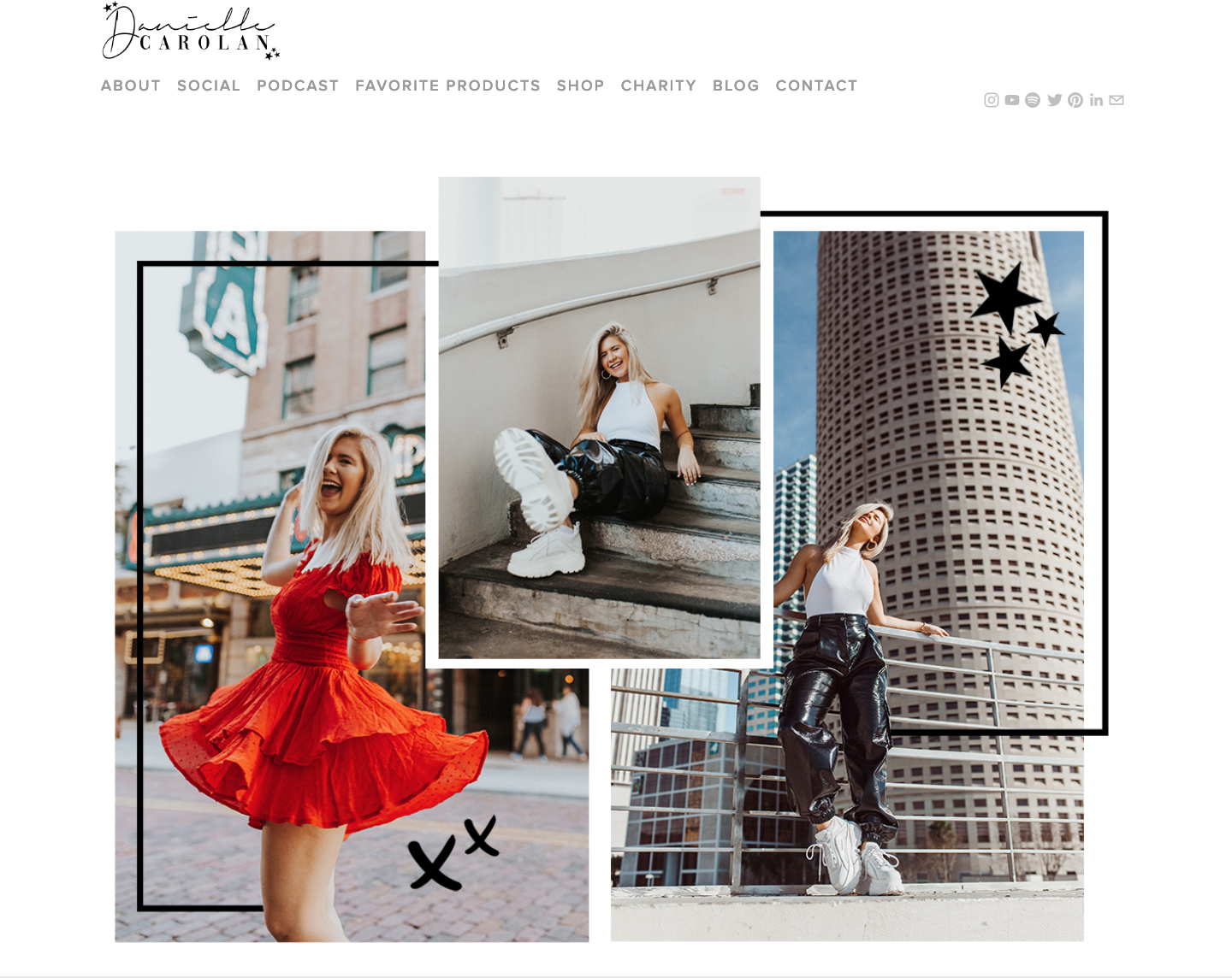
I had to zoom out a lot to capture her home page in a screenshot, but I absolutely love the layout she used for her header images. This may be harder to recreate, but it’s still nice for some inspiration. It looks as if she put the stars and borders on the images in Photoshop, but I am not sure how she arrange the pictures to lay on top of each other in html. I’m sure it wouldn’t be hard to recreate, but it really makes the site look more sophisticated.

Although I do really enjoy the layout of her website, if it were me, I would downsize some of the content so it wasn’t so large on screen. It may not look as large in these pictures, but thats because I had to zoom out to about 60%. Again the effects on the images look like they were down in Photoshop, and I really like how simple they are but they also make the design more edgy and unique.

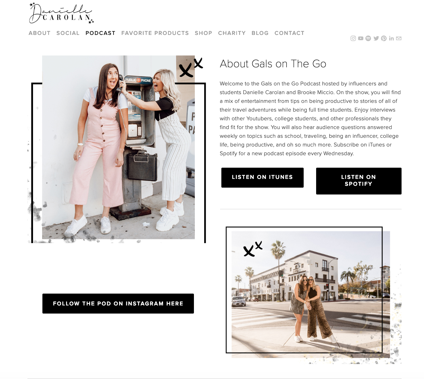
One thing I would suggest to change is a few of the tabs in the navigation bar. The first thing that caught my eye was the tab labeled “Charity.” This links to a page where she lists three charities and a button people can click to donate if they want to. I would guess that not a lot of Danielle’s viewers, which are girls mostly either in high school or college, do not have the money to donate to charities. I would say this tab is a little out of place and shouldn’t be a part of her website. If she truly wanted to include these charities she might want to consider placing them under her about me page, where she can talk about why she is passionate about each. They should not have their own tab in the navigation because although she may care about these causes, they aren’t a part of her brand.

Another thing I would suggest changing in the navigation bar is to also get rid of the social tab. She lists all of her social media account on the right hand side of the navigation bar, so having both is a little repetitive.

Overall, I really like this website and it helped me with some design layout inspiration for my own blog.

Layout Cheat Sheets

If you’re like me, you enjoy design webpages because you get to play around with different styles to make something your own. However, if you’re like me, you also have a lot of big ideas in your head of what you want something to look like, but don’t know where to start.

The easiest thing I’ve learned to do when I’m faced with this problem is to copy others.

Now copying others and not giving them credit or claiming it as your own work isn’t okay, but copying others and giving them the right recognition is.

There are plenty of links and websites out there giving different website layouts and how to code them. Below, I’ve linked a few of my favorites and why I like to use them.

How to create a simple layout with CSS Grid Layouts

https://developers.google.com/web/updates/2017/01/css-grid

I find it easiest to look at a few of the examples above, and then take a piece of paper and something to draw with. I then draw a layout I want to use and imagine what sort of content I would put in each of the boxes. I’m more of a visual learner so this helps me get a rough picture of where I want to start, but it’s important to remember that web design is something that can easily be changed and isn’t set in stone.

Drawing offers a rough draft, and to start, you can either use notebook or printing paper. Use a piece of scrap paper or draw on the notes of your phone if you have to, the most important thing for us beginner designers who are also visual learners is to start seeing whats in our head come to life on paper before trying to design it. This way we can see what works and what doesn’t, before designing anything I always sketch a rough draft. Sometimes what my design ends up being doesn’t even look remotely similar to what I sketched, but its a nice way to get my ideas flowing. Plus, you can always revert back to pencil and paper in the middle of your design process.

What I like to do when I’m sketching something for my website is first sketch what I want it to look like for viewers, which is also the visual in my head. After I get all of these ideas down, I then start a different draft of the layout.

For example, I could have a visual in my head of my posts being in columns, having feature images, headers, and links to the full post. Then, in my second draft of the layout I would sketch the different html elements I would need to complete this layout and where each would go. Such as, section, image, header, a button, ect..