
Danielle is a college student that posts content about her life as a student at the University of Georgia, and I have been following her for a while because I really enjoy the content she creates.
Although I mainly follow her youtube channel, I recently checked out her website for some design inspiration.
I had to zoom out a lot to capture her home page in a screenshot, but I absolutely love the layout she used for her header images. This may be harder to recreate, but it’s still nice for some inspiration. It looks as if she put the stars and borders on the images in Photoshop, but I am not sure how she arrange the pictures to lay on top of each other in html. I’m sure it wouldn’t be hard to recreate, but it really makes the site look more sophisticated.
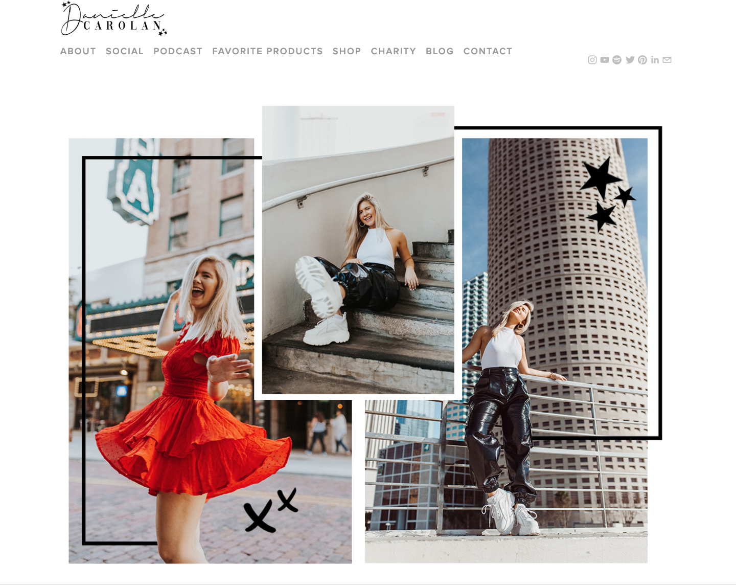
Although I do really enjoy the layout of her website, if it were me, I would downsize some of the content so it wasn’t so large on screen. It may not look as large in these pictures, but thats because I had to zoom out to about 60%. Again the effects on the images look like they were down in Photoshop, and I really like how simple they are but they also make the design more edgy and unique.
One thing I would suggest to change is a few of the tabs in the navigation bar. The first thing that caught my eye was the tab labeled “Charity.” This links to a page where she lists three charities and a button people can click to donate if they want to. I would guess that not a lot of Danielle’s viewers, which are girls mostly either in high school or college, do not have the money to donate to charities. I would say this tab is a little out of place and shouldn’t be a part of her website. If she truly wanted to include these charities she might want to consider placing them under her about me page, where she can talk about why she is passionate about each. They should not have their own tab in the navigation because although she may care about these causes, they aren’t a part of her brand.
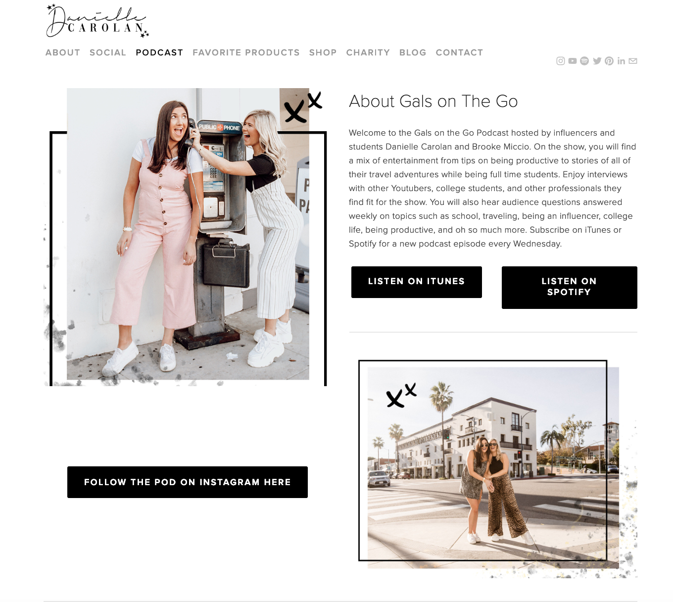
Another thing I would suggest changing in the navigation bar is to also get rid of the social tab. She lists all of her social media account on the right hand side of the navigation bar, so having both is a little repetitive.
Overall, I really like this website and it helped me with some design layout inspiration for my own blog.
