Script Fonts

Although I didn’t change the font that came with the template for my website, I found an article on designhack.net that has some of the best script fonts specifically for websites.

I thought it was an interesting article so I wanted to share a few of the fonts they mentioned.

The article starts out by stating how good scripts are hard to find, and I would agree. I have downloaded multiple script fonts from dafont.com because they looked pretty in the example, but when I applied my text in the same font, it looked different and didn’t flow as well. Although they are pretty, script fonts can sometimes be hard to read as well, which makes finding a good one even more difficult.

Below are a few examples of script fonts that actually work.

  1. Pacifico- a round, loopy font that works well with any text.
  2. Cookie- this font reminds me of the classic cursive you learned in elementary school.
  3. Leckerli One- I really like this one, so much in fact that I went and downloaded it right after seeing it. Reminds me a little of Pacifico but fatter and bolder.

Blog Spotlight: Danielle Carolan

Danielle is a college student that posts content about her life as a student at the University of Georgia, and I have been following her for a while because I really enjoy the content she creates.

Although I mainly follow her youtube channel, I recently checked out her website for some design inspiration.

I had to zoom out a lot to capture her home page in a screenshot, but I absolutely love the layout she used for her header images. This may be harder to recreate, but it’s still nice for some inspiration. It looks as if she put the stars and borders on the images in Photoshop, but I am not sure how she arrange the pictures to lay on top of each other in html. I’m sure it wouldn’t be hard to recreate, but it really makes the site look more sophisticated.

Although I do really enjoy the layout of her website, if it were me, I would downsize some of the content so it wasn’t so large on screen. It may not look as large in these pictures, but thats because I had to zoom out to about 60%. Again the effects on the images look like they were down in Photoshop, and I really like how simple they are but they also make the design more edgy and unique.

One thing I would suggest to change is a few of the tabs in the navigation bar. The first thing that caught my eye was the tab labeled “Charity.” This links to a page where she lists three charities and a button people can click to donate if they want to. I would guess that not a lot of Danielle’s viewers, which are girls mostly either in high school or college, do not have the money to donate to charities. I would say this tab is a little out of place and shouldn’t be a part of her website. If she truly wanted to include these charities she might want to consider placing them under her about me page, where she can talk about why she is passionate about each. They should not have their own tab in the navigation because although she may care about these causes, they aren’t a part of her brand.

Another thing I would suggest changing in the navigation bar is to also get rid of the social tab. She lists all of her social media account on the right hand side of the navigation bar, so having both is a little repetitive.

Overall, I really like this website and it helped me with some design layout inspiration for my own blog.

Picas vs Inches

This post is more about InDesign than any other adobe application I have mentioned before because it really only applies to things you would be creating in InDesign.

When I first started using InDesign I noticed whenever I would create a new document it would change inches to something that looked like this: 1p0.

I had no idea what the p meant or the number before or after it, and usually would change it back to something I was familiar with such as inches.

After sometime though I realized the p stands for picas which is a form of measurement of points, and is smaller than centimeters.

It is important for designers to know how to use picas because of the accuracy they can create in measurements. Picas are smaller than points, and one point is equal to 1/72 of an inch. I pic is equal to 12 points, which is equal to 1/6 of an inch.

Picas can used to when designing multiple different formats, however they are especially useful when designing a brochure, which is what I was designing when I learned about picas.

Easy Ways To Generate Color Pallets

If you’re like me, a beginner at all things design, you may feel a little lost when it comes to deciding what colors work best together.

One problem I often face is liking different colors separately, but when I put them together they don’t mix as well as I thought they would. To fix this problem I usually use an online color pallet generator.

I use the adobe color pallet generator as well as a website called coolors.com.

Adobe’s generator is very helpful because you can find a color you like and then they will help you find other colors that go well with what you chose. They also give you the CMYK and RGBA numbers which can be useful when using InDesign.

Coolors.com is more fun in my opinion because all you have to do is press your spacebar on your keyboard, and the website will automatically generate a pallet for you. It’s fun to click through the different ones you come up with until you find one you really like. I use this website when I’m feeling lazy (most of the time) and don’t want to do the work myself.

ABGT… InDesign

InDesign is great because there are so many different documents you can create.

When you first open InDesign you are presented with a screen that looks like this

To create a new document all you have to do is select “create new.” This will then take you to a page that looks like this

Its easy to feel overwhelmed if you click through the different tabs at the top labeled “print, web, and mobile” however, were going to ignore those for now and focus on creating a custom document.

I want to create a business card, so, after looking up the standard business card size I found that it needs to be 2 by 3.5 inches. To change these settings simply go to the drop down menu where it currently says picas and change it to inches. Then, put 3.5 in for the width and 2 in for the height. Finally, I want my card to be horizontal so I will select the icon next to the height drop down menu which shows a man either horizontally or vertically.

Before I click create however, I also un-click the tiny text box labeled “facing pages.” Facing pages are important if you are creating a brochure, or a document that has pages that will face each other but in this case we don’t want that.

After learning the basics on how to create a new document, we can now start creating!

ABGT… InDesign

For me, InDesign was something I always thought you had to have years of experience as a graphic designer or web content creator in order to use. However, after finding a helpful tutorial guide on lynda.com, I am able to more comfortably use InDesign to create graphics.

Here is the link to the tutorial if you would like to check it out for yourself: https://www.lynda.com/InDesign-tutorials/Adding-page-numbering/756295/805714-4.html?autoplay=true

I like this tutorial because its for the very, very, very, beginners, which is something I’ve touched on in an earlier post. There is no need to worry if you have never made anything graphic related, this tutorial walks you through the very basics such as what each tool means in the tool bar.

The first chapter in this tutorial teaches us how to add text using a text box. This may seem simple enough, but there are actually a few ways you can do this and its important to know what each box actually means.

Another important lesson I learned from this first chapter was to get used to clicking back to the selection tool, which is at the very top of the toolbox and looks like an arrow, or otherwise you could mess up what you were just working on. If you do mess up however, it should be easy enough to fix with the undo command but it is necessary to start practicing going back and selecting the selection tool when you want to rearrange something.

Another simple but important lesson is to utilize the zoom in and zoom out tools. This is helpful when working with smaller graphics or text, and is another thing you want to practice using.

In the next ABGT post I will be using this same tutorial to talk more about how to create different documents in InDesign.

A Beginners Guide To… Canva

In my opinion, Canva is an easy way to design something if you are a complete design beginner, or if you’re really cut for time.

If you don’t know what Canva is its essentially a website that offers multiple layout and design options you can use to make something your own. I like to occasionally use it to gather inspiration about how to design something such as a logo or header.

It’s easy to use because you can choose what you want to design (like a logo) and Canva will give you multiple designs to choose from. Each design will be in the correct pixel size which makes it easy to use and download.

You can sign up for a free account, or pay to have an account. While designing my logo, I signed up for a thirty day free trial so that I would be able to download my design as a png, which makes the background transparent and easier to work with.

Layout Cheat Sheets

If you’re like me, you enjoy design webpages because you get to play around with different styles to make something your own. However, if you’re like me, you also have a lot of big ideas in your head of what you want something to look like, but don’t know where to start.

The easiest thing I’ve learned to do when I’m faced with this problem is to copy others.

Now copying others and not giving them credit or claiming it as your own work isn’t okay, but copying others and giving them the right recognition is.

There are plenty of links and websites out there giving different website layouts and how to code them. Below, I’ve linked a few of my favorites and why I like to use them.

How to create a simple layout with CSS Grid Layouts

https://developers.google.com/web/updates/2017/01/css-grid

I find it easiest to look at a few of the examples above, and then take a piece of paper and something to draw with. I then draw a layout I want to use and imagine what sort of content I would put in each of the boxes. I’m more of a visual learner so this helps me get a rough picture of where I want to start, but it’s important to remember that web design is something that can easily be changed and isn’t set in stone.

Drawing offers a rough draft, and to start, you can either use notebook or printing paper. Use a piece of scrap paper or draw on the notes of your phone if you have to, the most important thing for us beginner designers who are also visual learners is to start seeing whats in our head come to life on paper before trying to design it. This way we can see what works and what doesn’t, before designing anything I always sketch a rough draft. Sometimes what my design ends up being doesn’t even look remotely similar to what I sketched, but its a nice way to get my ideas flowing. Plus, you can always revert back to pencil and paper in the middle of your design process.

What I like to do when I’m sketching something for my website is first sketch what I want it to look like for viewers, which is also the visual in my head. After I get all of these ideas down, I then start a different draft of the layout.

For example, I could have a visual in my head of my posts being in columns, having feature images, headers, and links to the full post. Then, in my second draft of the layout I would sketch the different html elements I would need to complete this layout and where each would go. Such as, section, image, header, a button, ect..

Four Types Of Navigation

The following information comes from: http://www.oreilly.com As web designers, we need to consider the importance that navigation has on a webpage. A website must flow together, and similar content should be placed together in a way that is easy for your user to navigate. For example, the image below shows an example of a bad navigation design.Image result for bad navigation design There are too many links, and makes it hard to find what you are looking for. to fix this, the web designer should utilize sub links and organize things that make sense together. For example, there are multiple tabs on car parts that would make more sense if they were grouped together instead of next to lightbulbs. The author of this article explains that there are five ways to distinguish navigation. They are: type of content, links and transitions to other pages, tasks of seeking the mechanisms, visual layout, and position of navigation on a page. All of these aspects help viewers of your site determine what the main navigation is. There are also three categories of navigation. Structural, Associative, and Utility. 
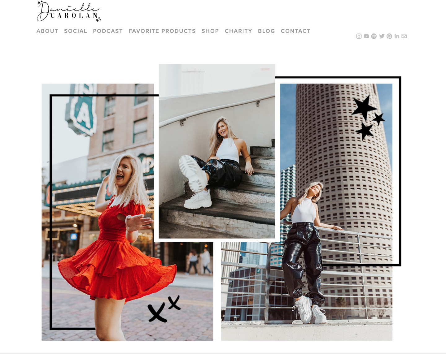
This website can be described as being in the Utility category for navigations, because there is no hierarchy of pages and each page connect and help users use the site. Other websites may have a structural or associative navigation system, which is when one page connects to another based on hierarchy or pages are connected based on similar content.

Making A Logo On Canva

If you read my “A Beginners Guide To… Photoshopping A Logo” post, you may know that my attempt was a fail. There are still so many things I need to learn about Photoshop, and trying to make my own logo was a little too ambitious for my beginner status. However, I’m much more familiar with canva.com, and I would recommend this to any new web designer who may need to make something in a pinch that also doesn’t require too much effort or time. They have layouts for almost anything you would need for online design. From business cards, to twitter headers. This is why I would recommend new designers to start with Canva, and then move to Photoshop. Use Canva to learn different ways to move elements around and create designs because a lot of what they offer is already made and set up for you to play around, and then when you feel comfortable you can learn how to create these designs on your own in Photoshop. To get started, I you need to log in or make an account. After doing this, you are given the option to choose between different layouts, or start with a blank slate. I chose the logo layout because I thought it would be the easiest. Then, I found a design and font I really liked and was able to change the colors to make it my own. You can change these by clicking the top bar on the design, and expand to find more options. You can even erase certain elements if you want to try and incorporate your own design ideas. This is a good way to have fun with design without worrying about messing up a design you may be working on, because if you don’t like what you’ve done you can start over with the premade design. I thought the font for my logo could be described as edgy and different, while still being simple enough to not scare away any potential viewers. Choosing a font for your logo is very important and should be one of the most, if not the most, time consuming parts when designing a logo. Take some time to research more about the different types of fonts and what makes a font readable. You want your font to have a high level of readability so that viewers can easily see, and will want to keep viewing your content. I decided to keep the design simple and the only element besides the text was a simple bar that was placed behind the text and rotated at an angle. This was a very simple and easy element to add, and it made the logo design come together. It’s important to note that in order to download a .png version of my logo, I did have to sign up for a thirty-day free trial. Since I don’t know how to make a picture transparent I thought it was worth it, but this is something you may not want to do.